HTML Dungeons: Maps
Adventure maps perform multiple functions. For us, the two most important are communicating:
- Environmental and aesthetic flavour. Vibes.
- Concrete information about the imagined space so referees can give clear descriptions, and players can situate themselves and explore with confidence.
So we like pretty, expressive maps, and we also like them to be usable and easy to reference. Linking keyed locations to their descriptions helps with these goals. And clickable/tappable maps are just fun to use, too.
Linking a map to room or location descriptions turned out to be trickier than we thought it would be. Web 1.0 style image maps are not responsive and so don’t cut it in 2022. We don’t think we’ve arrived at the best solution yet, but here is what we’re doing right now, and it works.
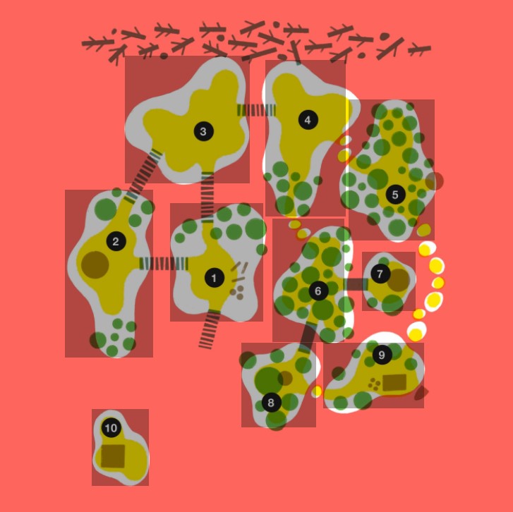
This is how we marked up the map from Swamp Renewal:
<div id="map">
  <a href="#1-swamp-port" title="1. Swamp Port" class="port"></a>
  <a href="#2-wizards-tower" title="2. Wizard's Tower" class="tower"></a>
  <a href="#3-peat-mine" title="3. Peat Mine" class="mine"></a>
  <a href="#4-clearing-zone" title="4. Clearing Zone" class="clearing"></a>
  <a href="#5-gas-farm" title="5. Gas Farm" class="gasfarm"></a>
  <a href="#6-forest" title="6. Forest" class="forest"></a>
  <a href="#7-druids-hut" title="7. Druid's Hut" class="hut"></a>
  <a href="#8-shrine" title="8. Shrine" class="shrine"></a>
  <a href="#9-campsite" title="9. Campsite" class="campsite"></a>
  <a href="#10-oblongs-island" title="10. Oblong's Island" class="oblongs"></a>
  <img src="images/swamp-map-web.jpg" Alt="A map of the Forgotten Quag.">
</div>
It’s a div containing a series of anchor links that point to location descriptions. At the end of the list is our map image.
Note that each link includes a title and class attribute. The title value will appear as a tooltip if the user hovers their mouse over the link target area. We use the class value to reference the link in our CSS, so we can define each link’s size and location on our map.
Here is the CSS for our linked map:
#map { position: relative; width: 100%; margin: 0 auto; }
#map img { max-width: 100%; height: auto; display: block; }
#map a { position: absolute; z-index: 2; }
#map a:hover { border-bottom:0; background: transparent; }

.port { left: 33.31%; top: 39.69%; width: 18.15%; height: 23%;  }
.tower { left: 12.8%; top: 36.95%; width: 17.19%; height: 32.74%; }
.mine { left: 24.5%; top: 10.98%; width: 24.32%; height: 24.82%; }
.clearing { left: 51.89%; top: 11.73%; width: 15.62%; height: 30.53%; }
.gasfarm {left: 68.05%; top: 19.44%; width: 16.76%; height: 27.5%; }
.forest { left: 53.21%; top: 42.69%; width: 13.98%; height: 24.04%; }
.hut { left: 70.68%; top: 49.04%; width: 10.49%; height: 11.63%;  }
.shrine {left: 47.18%; top: 66.83%; width: 14.62%; height: 16.44%; }
.campsite { left: 63.05%; top: 66.8%; width: 19.76%; height: 12.77%;  }
.oblongs { left: 18.12%; top: 79.74%; width: 11.06%; height: 14.91%; }
Each link is an absolutely positioned rectangular box defined by percentages. That’s what makes them scalable and responsive. They’re invisible, but if you could see them, they’d look like this:

We used this responsive image map generator to define our target areas. It doesn’t give us the exact code we want, but it does provide the most important information: those location and size percentages for our target areas. There might be a better tool for this job but we haven’t found it (or made it) yet.
Using this method you are limited to rectangular target areas on your maps. You could instead use SVGs, which allow for any kind of target shape:
- Create responsive SVG image maps
- Hyperlinks/Anchors Inside SVG Graphics
- Create A Responsive Imagemap With SVG
We’ll try that next.
One last thing: We just added a tiny, persistent reference map to the fixed sidebar on Swamp Renewal. We love it, we hope other people do it too.
Previously: HTML Dungeons: Links
